

Share this article
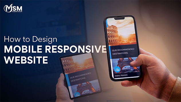
How to Design Mobile Responsive Website?
Facing certain challenges while developing a good mobile responsive website design? Here’s your complete guide, that will tell you how to build such a website in the best way possible.
In 2026, mobile responsive designs have evolved from a recommended best practice to an absolute business necessity. Mobile devices are considered as 70% of the internet traffic devices globally due to which there is huge need and demand of making mobile compatible websites for businesses. It is necessary for brands to elevate their user experience and beat the competition in the market.
Moreover, 70% of the web traffic comes from mobile devices only because of the affordability and convenient nature of mobile devices. They make everything compatible and effectively working from social media to mobile optimized sites.
Now, moving forward, this blog will step-wise let you know how to make a mobile website, with process, features, cost, frameworks and best practices.
Why is Mobile Responsive Design for Business Websites Necessary?
Your business needs a mobile responsive website design because more than half of the internet users explore websites through their mobile devices. Moreover, Google also promotes only mobile compatible websites and gives that brand more visibility. A good responsive website design allows users to easily navigate, click buttons and read the written texts. This keeps users more engaged and decreases the bounce rates on the platform. Without such a design you can get a risk of frustrating potential customers and hurting your online presence.
Key Benefits of Mobile-Friendly Design For Businesses
- Higher Conversion Rates -Seamless mobile design can push users to completely explore your website and fulfill desired options like checkout, fill forms or contact easily. Responsive design helps customers in easily checking out business key details of products and offerings.
- Better User Experience – Provides fast loading, easy reading text without zooming, simple clickable options makes the site more pleasant to use. If you provide a good customer experience then the user who will be redirected on your page will spend more time on your website. If they do not buy any product, surely they will engage with your brand in future.
- Competitive Advantage – If you have a good mobile website design then you can easily outlook your industry competition very easily. An intuitive mobile design can position your brand modern and consumer focused.
- Enhanced SEO Rankings -Popular search engines like Google prefer sites that are responsive to every device. By using a “mobile-first” approach, it ensure ranking of mobile-friendly websites higher and clearer.
- Future-proofing -Responsive website design allows your website to adapt to changing situations on different screen sizes, ensuring suitability across different devices respectfully. Digitally trends change on a daily basis and to keep up with that businesses need a good response website design.
- Increased Mobile Traffic -With more than 55% of the global web traffic being on mobile, a non-responsive website design offers a high bounce rate and loss of sales and consumers. If your website can operate seamlessly across different devices, especially on smartphones then it can easily and fastly reach your target audience.
Best Practices For Mobile Responsive Web Design
While choosing a responsive web design project, you should ensure success by following some of the below written best practices that perfectly aligns with the flexible text, layout and padding of the website.
1. Start with a Mobile-First Design Strategy –
Mobile compatible websites have the most unique formatting and design challenges, so designing websites mobile compatible and scaling it up for future is very necessary. Please make an intuitive design and layout that perfectly fits in smartphone sizes.
2. Implement Fluid Grid Systems and Flexible Images –
Generate images in 4 px and ensure easy scaling to any point with integrating necessary fluid grid format. Test across checkpoints on different devices like laptops, desktop, mobile displays and other displays that can be relevant for your target audience.
3. Optimize design for Touchscreen Interactions –
User interfaces can vary depending upon the method of interaction, because exploring a website on desktop with a mouse and keyboard or looking at a website through touchscreen device can be unique and exactly opposite. Touchable elements should be large enough and easily usable with simple navigation.
4. Prioritize Content for Smaller Screens –
Making responsive breakpoints to perfectly align the action of each layout style is necessary. Decide on what is visually and functionally necessary and what element can be more engaging on the small screens.
5. Utilise Responsive Design Patterns –
There are mainly five types of responsive design patterns i.e, column drop, layout shifter, tiny tweaks, mostly fluid and off-canvas. These patterns easily help in designing multi-column patterns that perfectly adjusts and keeping other elements hidden, not opened until the user clicks making the design clean and easily navigable.
6. Ensure Web Accessibility Across All devices –
An accessible mobile friendly website design applies four major principles i.e, operable, robust, perceivable and and easily understandable. Mobile accessibility should include adequate contrast and live elements that are easily focusable. Design with large perceived text size with support every moment with indicating each and every function perfectly.
7. Integrate Pre-designed theme or Layout –
The pre-designed themes and layout can become huge potential assets that will help you in developing and making the website more responsive. Moreover, in order to work with a precise theme, you have to make changes in colours, image and contents within the guidelines of the framework, this will allow you to remain responsive during challenging times.
8. Partner up with Professional Website Development Services –
In order to boost your performance with the development of custom responsive website development, you should look out for an expert website development company that has a good amount of experience in designing mobile responsive websites. Ensure looking at those organisations that include clear processes on each stage of the project.
Responsive Design Frameworks and Tools
Mobile responsive design is necessary for ensuring that your website can effectively work on different screen sizes. Moreover, a variety of tools and frameworks helps facilitate this process, by providing everything from pre-designed components to certain comprehensive testing environments.
Popular CSS Framework
Css Frameworks offer a set of standardised reusable codes that can effectively boost up the development process.
- Bootstrap – Twitter originally developed Bootstrap, one of the most widely used front-end frameworks. Moreover, it provides a comprehensive library of CSS and HTML, consisting of a powerful Mobile-friendly website design. Its exclusive documentation and vast library support makes it the most prominent tool for making wide projects from normal pages to high-end web applications.
- Tailwind CSS – Tailwind CSS takes a full utility-first approach. Instead of using pre-designed components, it offers a vast collection of low level utility classes that can be composed directly in HTML to make custom designs. Moreover, this methodology needs more initial setup but provides unparalleled flexibility and smaller final CSS files with discarding the unused styles.
Development Tools
Beyond suitable frameworks, a perfect set of tools help developers in creating and making testing responsive layouts.
- Browser Developer Tools – Renowned browsers like FireFox, Chrome, and Edge consist of built-in developer tools that allow development of “responsive design modes”. This will help developers in stimulating different screen resolutions and device types directly within the browser.
- Responsive Design Checkers – Browser extensions and mobile online tools can offer overview of a site’s appearance across a variety of device sizes. These tools are very helpful for rapid and quick visuals checks and identifications.
- Cross-Browser Testing Platforms – Platforms like Lambda Test provide automated and manual testing services on physical devices and on different browsers to ensure compatibility across the fragmented device landscape.
- Performance Monitoring Tools – Responsive design layout should not compromise the quality and speed of the website. Moreover, tools like Google’s PageSpeed Insights or GTmetrix explores how quickly a site loads on desktop and mobile with offering recommendations for more enhancements.
No-Code Solutions
- WordPress Responsive Themes – The WordPress ecosystem provides several pre-designed themes that allow users to design mobile responsive websites with the least technical efforts possible.
- Drag-and-Drop website Builders – Platforms like Webflow, Squarespace and Wix offer intuitive designs and visually appealing layouts. These tools automatically manage the underlying code and ensure the final site is made mobile responsive across devices.
Cost of Developing Mobile Responsive Website Design
Creation of response website designs can be more expensive and requires more effort, but the investment made is worthwhile. Mobile websites increase the visibility and offer scaling of business options easily with increasing the conversion rates.
- Basic and Small Business Website – Creating a mobile-friendly website can cost from $1,500 to $ 5,000+ depending upon the required preferences and customization features you require. (Standard templates with limited pages)
- Custom/Mid-Range Business website – For making exclusive custom featured websites need more additional functionality like Blog integration, Contact forms, etc), costing generally $5,000 to $15, 000+. (Custom design, CMS, advanced features).
- Advance Responsive Website – Developing highly responsive design with complex functionalities like booking systems, e-commerce or any large product catalogues can range from $15,000 to $50,000+, depending upon the preference of the project.
Mobile Responsive Design Trends For 2026
As of 2026, mobile responsive website design is constantly evolving beyond simple screen resizing to enhance and embrace highly interactive, AI-driven and tailored experiences. Below are some of the best trends for designing mobile responsive websites.
AI-Powered Adaptive Layouts for Personalized User Experiences
Artificial Intelligence is redefining the concept of modern web designs. As in 2026, websites are increasingly capable of adapting layouts, content placements and UI components according to user behaviour and preferences.
- Improved engagement and retention rates
- Image scaling and Attractive font
- Customized content layouts
Multi-Device Responsiveness: Foldables, Wearables and Beyond
Traditional breakpoints are no longer effective and enough. Moreover, foldable phones, dual screen devices and wearable gadgets require more flexible and fluid type of design strategies to fit extability in the device size.
- Context-aware UI adjustments
- Seamless transitions between different screen states
- Variable screen ratio management
Container Queries: The Evolution Beyond Media Queries
One of the most significant shifts in mobile responsive design is the spread of CSS container issues. Moreover, unlike media queries that mainly depend on viewport size, container queries allow components for adapting parent based containers.
- Better scalability in complex layouts
- Modular, reusable components
- Enhanced consistently of design system
Performance-Optimized Responsive Design for Superior User Experience
In today’s digital era, performance is not optional. Moreover, as web core vitals have become a key ranking factor, good and immersive mobile designs must increase the efficacy and speed across every type of device.
- Decreased JavaScript execution
- Quality font loading
- Optimized images and responsive media
Accessibility-Driven Responsive Design as a Standard Practice
Accessibility has become one of the most necessary pillars while making design responsive mobile websites. With the help of WCAG 3.0 guidelines are shaping the future as inclusive designs are easily usable by everyone, regardless of device compatibility.
- Readable typography across different screen sizes
- Keyboard and voice navigation assistance
- Touch-friendly interactive elements
Conclusion
This Responsive website design guide analysed that in 2026 responsive web design is more than just adopting new trends. It has become necessary for businesses to service and enhance their performance, intelligence and user experiences. Moreover, businesses that invest in modern responsive website designing services can easily create a competitive edge digitally on the search engines and can easily build digital trust.
Partnering up with a good website development company can help you in developing robust mobile websites. At MSM CoreTech Innovations, we focus on delivering highly engaging and adaptive web development services that are very complex to achieve. Our team of experts works 24*7 to improvise your business presence with constant support availability.

Related Posts

Top 9 B2B Web Design Companies in USA
B2B web design means creating websites for companies that sell products or services to other companies. These websites are not...
Read More

Things To Keep in Mind While Hiring A Web Design Company
Today, your website is the digital storefront of your business, often the initial touchpoint for potential customers. Thus, it reflects...
Read More

How Much Does Web Design Cost in Australia in 2026?
Understanding the Web Design Cost in Australia in 2026 can feel confusing, especially if you are starting your first website...
Read More