

Share this article


FinTech App Design Guide for Beginners: Best Practices & Tips
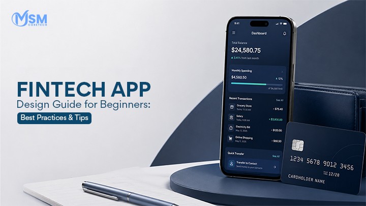
FinTech app design is the process of shaping how a financial app looks, feels, and behaves for the person using it, everything from the layout of a banking dashboard to the exact spot where a “Send Money” button sits on the screen. It is one of the most important, and most overlooked, parts of building a financial product.
Money is personal and emotional. When someone uses a game app or a shopping app, a confusing screen is a minor annoyance. But when someone is checking their savings, sending a payment, or applying for a loan, a confusing screen can make them genuinely anxious. That is why great UI/UX (User Interface and User Experience) is not just a nice bonus in FinTech; it is the foundation the entire product is built on. Users need to feel, from the very first screen, that their money is safe, that the app is simple enough to understand without a manual, and that the brand behind it is trustworthy.
In this guide, you will learn what FinTech app design really means, why it matters so much for both users and businesses, who typically uses these apps and what they expect, the full step-by-step design process, the features a modern app needs, detailed UI and UX best practices, security and accessibility standards, current AI trends, common mistakes to avoid, useful design tools, upcoming trends, realistic costs, and how to pick the right design partner. Let’s get started.
Also Read: Cost to Develop a Fintech App Like Wise
What is FinTech App Design?
Let’s slow down and unpack this idea piece by piece, because it is easy to use the term loosely without really understanding what it covers.
FinTech app design refers to the entire process of planning and creating the visual layout, the screen-by-screen flow, the buttons, the colors, the icons, the typography, and the overall experience of an app whose main job is handling money. This could be a banking app, a digital wallet, an investment platform, or any other tool related to finance. The ultimate goal of FinTech app design is simple to state but hard to achieve: make handling money on a screen feel easy, safe, and stress-free, even for someone who has never used a financial app before.
Difference between app development and app design
Beginners very often blend these two ideas, so it is worth separating them clearly. App design is entirely about how the app looks and feels to a human being. It answers practical questions such as: Where should the “Pay Now” button sit on the screen so a thumb can reach it easily? What color should represent a successful transaction versus a failed one? What should the very first three screens look like when someone opens the app for the first time? App development, on the other hand, is about actually building the working product behind those screens. Developers write the code that makes buttons respond to taps, connects the app securely to banking servers, processes real transactions, and stores data correctly. A simple way to picture the difference: design is like the blueprint, the paint color, and the furniture arrangement of a house, while development is the actual construction, the wiring, and the plumbing that make the house function. Neither one can succeed without the other, but they are distinct skill sets performed by different specialists, often working side by side throughout the project.
Why UX matters in financial services
UX, short for user experience, describes how a person actually feels while moving through the app, whether they feel confident and in control, or confused and stressed. In financial services specifically, trust is the single most valuable currency a company has. If a user struggles to find their account balance, or if a transfer button is buried three menus deep, they don’t just feel mildly annoyed; they start to wonder if something is wrong with the app itself, or worse, whether their money is actually safe. Good UX removes this anxiety completely by making every action predictable, every label clear, and every result immediately visible, so the user never has to guess what just happened to their money.
Examples of FinTech Apps
To make this concept less abstract, here are the main categories of apps that fall under FinTech app design, along with what makes each one unique:
Mobile banking apps
These let users check account balances, transfer money between accounts, pay bills, view statements, and manage their profile, all without visiting a physical branch. Design here focuses heavily on clarity and speed, since these apps are used daily, sometimes multiple times a day.
Digital wallets
Apps that securely store card details and payment information, allowing quick tap-to-pay purchases in stores, fast checkout online, and instant peer-to-peer transfers to friends or family. Design here focuses on speed and minimal friction, since wallet apps are often used in the middle of a checkout line.
Investment apps
These allow everyday people to buy and sell stocks, mutual funds, ETFs, or other assets, usually through dashboards showing portfolio value, gains, losses, and market trends. Design here has to balance simplicity for beginners with enough depth and data for more advanced investors.
Lending apps
Apps that let users apply for personal loans, check their eligibility, upload income or ID documents, and track repayment schedules. Design here focuses on reducing anxiety during a naturally stressful process, and on making document upload as painless as possible.
Insurance apps
Apps that help users compare and buy policies, file claims, upload photos of damage, and track the status of a claim in real time. Design here focuses on replacing what used to be long paperwork with a guided, step-by-step digital experience.
Cryptocurrency apps
Apps that let users buy, sell, store, and track digital currencies like Bitcoin or Ethereum. Design here has the added challenge of explaining unfamiliar concepts (wallets, keys, blockchain confirmations) in plain, non-technical language.
Each of these categories has its own quirks and challenges, but they all share the same underlying mission: take something that involves real money and real consequences, and make it feel simple, transparent, and safe on a small screen.
Also Read: Crypto Wallet App Development Guide
Why Good UI/UX Matters in FinTech Apps
Good design in FinTech is not just a matter of taste or aesthetics; it has direct, measurable effects on how a business performs and how users feel. Let’s look at each benefit in detail.
Builds customer trust
When an app looks clean, modern, well-organized, and professional, users instinctively trust it more, often without even realizing why. A cluttered layout, mismatched fonts, or outdated visuals send an unconscious signal that the company behind the app might also be careless about more serious things, like security. First impressions form within seconds, and in FinTech, that first impression often decides whether a user completes sign-up at all.
Increases engagement
When an app is genuinely pleasant and easy to use, people open it far more often. Instead of only logging in when they absolutely have to, users start checking their spending patterns, glancing at their savings progress, or browsing investment options simply because it is not a chore to do so. This increased, voluntary engagement is one of the clearest signs of good design at work.
Improves retention
A confusing, frustrating app pushes users toward the exit, often permanently. When people cannot easily complete basic tasks, they don’t complain, they usually just quietly switch to a competitor. Thoughtful design keeps people around because they always know exactly what to do next, without needing to relearn the app every time they open it.
Reduces user errors
In most apps, a mistake is a small inconvenience. In a financial app, a mistake can mean sending money to the wrong account, misreading a balance, or missing a loan payment because a due date was easy to overlook. Careful design, using clear confirmations, obvious labels, and smart warnings, dramatically reduces the chances of these costly slip-ups happening in the first place.
Boosts transaction completion rates
Every extra screen, every unclear label, and every unnecessary form field is an opportunity for a user to give up halfway through a payment or transfer. Streamlined, well-designed flows keep users moving smoothly from start to finish, which directly increases the percentage of transactions that actually get completed rather than abandoned.
Strengthens brand credibility
A well-designed app reflects on the entire company, not just the app itself. It quietly communicates, “we pay attention to detail, and we take your money seriously.” Over time, this consistent impression builds a reputation that is genuinely difficult for competitors to copy, and equally difficult to win back once it has been damaged by a poor experience.
Understanding FinTech Users
You cannot design a good financial app without first understanding exactly who will be using it and what they need from it. FinTech apps tend to serve a surprisingly wide range of people, each with different comfort levels, goals, and expectations.
Target Audience
- Beginners – People who are new to managing money through an app and may feel intimidated by financial terms like “APR,” “portfolio,” or “KYC.” They need extra guidance, plain language, and reassurance at every step.
- Investors – Users who are comfortable with financial concepts and want detailed data, live charts, and real-time market information to make informed decisions quickly.
- Business owners – People managing company finances who often need to handle multiple accounts, track invoices, manage payroll, and export reports for accounting purposes.
- Students – Typically on a tight budget, looking for simple, low-cost tools to track spending, split expenses with friends, and build early saving habits.
- Millennials – A generation that grew up with smartphones and expects fast, mobile-first, app-based solutions, with very little patience for paperwork or long phone calls.
- Senior users – People who may be less comfortable with technology and often need larger text, simpler menus, high-contrast visuals, and very clear, jargon-free instructions.
User Expectations
Regardless of which group a person belongs to, most FinTech users share a fairly consistent set of expectations:
- Fast onboarding – Nobody wants to spend twenty minutes filling out forms and uploading documents just to open an account; every extra step increases the chance they give up entirely.
- Secure authentication – Users want visible proof, not just a promise, that their login credentials and personal data are being protected properly.
- Easy navigation – People expect to reach any feature they need within just a couple of taps, not by digging through nested menus or unclear icons.
- Transparent fees – Hidden charges that appear only after a transaction is complete are one of the fastest ways to destroy user trust; fees should be visible before any action is confirmed.
- Quick transactions – Sending money, paying a bill, or checking a balance should take seconds, not minutes, especially since many of these actions happen while users are on the go.
Understanding these expectations in detail is what separates a generic app from one that genuinely feels built for its users.
Also Read: Build Your Own Payment Gateway
Essential Principles of FinTech App Design
These are the foundational ideas that should guide almost every decision made while designing a financial app.
Keep the Interface Simple
Avoid clutter at all costs. Show only what the user actually needs in that specific moment, and tuck advanced or rarely used options behind simple secondary menus, so the main screen never feels overwhelming or intimidating.
Design for Trust
Every single screen, from the login page to the transaction confirmation, should feel calm, professional, and reliable. Avoid flashy colors, unnecessary animations, or playful elements that could make a serious financial action feel less credible.
Maintain Consistency
Buttons, colors, fonts, spacing, and icons should behave identically throughout the entire app. If a “Confirm” button is blue and rounded on one screen, it should look and act exactly the same way on every other screen, so users never have to relearn the interface.
Focus on Accessibility
Design with everyone in mind, including people with visual, hearing, cognitive, or motor difficulties. This is not just good practice; in many countries it is also a legal requirement for financial services.
Mobile-First Design
The overwhelming majority of FinTech users interact with their accounts primarily through their phones, so design decisions should start with the smallest screen first, then scale up thoughtfully to tablets or desktop views.
Fast Performance
Slow loading screens are especially frustrating in financial contexts, where users are often trying to complete something time-sensitive, like paying a bill before a deadline. Every single screen should load quickly and respond instantly to taps.
Data Transparency
Always show users exactly what is happening to their money in real time, including applicable fees, current transaction status, and expected timelines, instead of leaving them to wonder or guess.
Personalization
Wherever it makes sense, tailor the experience to the individual user, such as showing relevant spending insights, personalized savings suggestions, or a dashboard arranged around their most-used features, without ever feeling intrusive or overly automated.
Also Read: How to Build a Mobile Banking App?
Step-by-Step FinTech App Design Process
Designing a FinTech app properly is a structured, multi-stage journey, not a single burst of creativity. Here is what each stage looks like in practical, simple terms.
Step 1 – Market Research
Before any screen is sketched, the team studies the broader financial market, current industry trends, relevant regulations, and how similar existing apps are performing, both their strengths and their weaknesses.
Step 2 – Competitor Analysis
The team closely examines competitor apps, testing their onboarding flows, studying their dashboards, and noting what frustrates real users, so the new app can genuinely improve on what already exists rather than simply copying it.
Step 3 – User Research
Real potential users, drawn from the actual target audience, are interviewed or surveyed to uncover their specific pain points, daily habits, financial goals, and honest expectations from a financial app.
Step 4 – Create User Personas
Using the research gathered, the team builds a small set of realistic, fictional profiles representing different user types, such as “a 24-year-old student trying to save for the first time” or “a small business owner juggling multiple accounts and invoices,” so every later decision can be checked against real needs.
Step 5 – Build User Flow
The team carefully maps out the exact sequence of screens and actions a user will move through to complete a specific task, such as opening a new account or sending a payment, identifying every decision point along the way.
Step 6 – Wireframing
Simple, black-and-white sketches of each screen are created to plan the basic layout and structure before any colors, images, or final visuals are added. This lets the whole team agree on the skeleton of the app quickly and cheaply, before investing serious time into polish.
Step 7 – UI Design
With the structure agreed upon, the actual visual design work begins, adding colors, typography, icons, imagery, and spacing to turn the plain wireframes into a polished, on-brand-looking app.
Step 8 – Interactive Prototyping
The static, finished-looking designs are converted into a clickable prototype that behaves much like the real app, allowing stakeholders and testers to click through an experience before a single line of code is written.
Step 9 – Usability Testing
Real users are invited to try the prototype and attempt specific tasks while designers quietly observe where they hesitate, get confused, or make mistakes, and the design is then refined directly based on this honest feedback.
Step 10 – Developer Handoff
Once the design has been finalized and tested, all design files, detailed specifications, and visual assets are formally handed over to the development team, who will use them as the exact blueprint for building the real, working application.
Following this app development process consistently reduces expensive rework later on and greatly increases the odds that the finished app actually solves the real problems users have.

Also Read: Cost To Build A Fintech App
Must-Have Features in a Modern FinTech App
A modern, competitive FinTech app usually combines many of the following features to keep users satisfied, engaged, and safe.
- User Registration – A simple, guided sign-up process that lets a new user create an account with the minimum necessary friction.
- KYC Verification – “Know Your Customer” checks that confirm a person’s real identity, often legally required before they can move money.
- Biometric Login – Fingerprint or facial recognition that allows fast, secure access without typing a password every time.
- Dashboard – A central home screen summarizing account balance, recent activity, and the most important information at a single glance.
- Account Management – Tools that let users update personal details, linked bank accounts, notification settings, and other preferences.
- Transaction History – A clear, searchable record of past payments, transfers, and purchases, usually with filtering options.
- Real-Time Notifications – Instant alerts sent the moment a transaction, security event, or important account update occurs.
- Expense Tracking – Automatic categorization of spending, so users can clearly see where their money is actually going each month.
- Budget Planning – Tools that help users set spending limits, savings goals, and track progress toward them over time.
- Investment Tracking – Dashboards that show portfolio value, individual asset performance, and overall gains or losses at a glance.
- Digital Wallet – A secure place to store payment methods for fast, convenient transactions both online and in physical stores.
- Bill Payments – The ability to pay utility bills, subscriptions, credit cards, or loan installments directly within the app.
- QR Code Payments – Scan-to-pay functionality that speeds up in-person transactions without needing to type in card details.
- AI Financial Insights – Smart, automatically generated suggestions based on a user’s spending habits, such as tips to reduce unnecessary subscriptions.
- Customer Support Chat – A built-in way to get quick help or answers without ever needing to leave the app or make a phone call.
- Multi-Currency Support – Useful for users who travel frequently or regularly deal with international payments and conversions..
FinTech UI Design Best Practices
These practices focus specifically on the purely visual side of a financial app, the part users see and interact with directly.
Clear Visual Hierarchy
The most important information, such as the account balance, should be immediately obvious the moment a screen loads, while secondary details are visually smaller, lighter, or placed further down the screen.
Minimalist Layout
Every single element on a screen should exist for a clear reason. Remove decorative elements, unnecessary borders, or redundant labels that don’t actively help the user complete their task.
Easy-to-Read Typography
Choose clean, legible fonts with generous spacing, especially for numbers and financial figures, since even a slightly ambiguous digit can cause real confusion or anxiety when money is involved.
Intuitive Navigation
At every point in the app, a user should instantly know where they are and how to get back to the home screen, without ever feeling lost or needing to guess.
Smart Color Psychology
Colors carry real emotional meaning. Green commonly signals success, growth, or a positive balance, red typically signals an error, warning, or a negative figure, and blue is widely used across FinTech to build a calm, trustworthy feeling.
Consistent Buttons
Buttons performing similar actions, like “Confirm,” “Send,” or “Cancel,” should always look and behave the same way throughout the entire app, so users build quick, reliable muscle memory.
Meaningful Icons
Icons should be immediately understandable at a glance, such as a simple wallet icon representing payments or a rising line chart representing investments, avoiding overly abstract or clever symbols.
White Space
Deliberately leaving empty space around text, buttons, and images prevents the screen from feeling cramped or cluttered, and naturally guides the user’s eye toward what matters most.
Card-Based Layout
Presenting related information inside neat, contained “cards,” such as an individual transaction card or an account summary card, makes content far easier to scan quickly and mentally organize.
Responsive Design
The app should look clean and function correctly across a wide range of screen sizes, from smaller phones to larger tablets, without any elements breaking, overlapping, or becoming unreadable.
Also Read: Top FinTech Trends
FinTech UX Best Practices
While UI focuses on appearance, UX focuses on how the entire experience actually feels while a real person is using it, step by step.
Reduce Cognitive Load
Never make users think harder than necessary. Break complex, multi-part tasks into small, clearly labeled steps instead of presenting everything at once and expecting people to figure it out.
Minimize Form Fields
Only ask for the information that is genuinely necessary at each specific stage of a process. Long, upfront forms are consistently one of the biggest reasons people quit a FinTech app during sign-up.
One-Hand Navigation
Since the vast majority of people use their phones with a single hand, place frequently used buttons and actions within comfortable thumb-reach, generally toward the bottom half of the screen.
Smart Search
Give users a fast, reliable way to search for past transactions, specific contacts, or particular features, instead of forcing them to scroll manually through long, unorganized lists.
Progressive Disclosure
Show only the basic, essential information first, and reveal more advanced details or options only when a user actively chooses to dig deeper, keeping the initial experience calm and uncluttered.
Personalized Dashboard
Surface the information that matters most to each user, such as their most frequently used features or recent activity, right at the very top of their home screen.
Contextual Help
Provide small, relevant tips or brief explanations exactly at the moment and place a user needs them, rather than burying help content in a separate, hard-to-find section of the app.
Error Prevention
Design forms and flows so that mistakes are naturally caught before they happen, such as requiring a clear confirmation step before a large transfer is finally sent.
Microinteractions
Small, subtle animations, like a satisfying checkmark appearing right after a successful payment, make the app feel genuinely responsive, alive, and trustworthy.
Instant Feedback
Every single action a user takes, even something as small as tapping a button, should trigger an immediate visual response, so they always know for certain that their action registered correctly.
Security Best Practices in FinTech Design
Security is not purely a technical, behind-the-scenes concern; it is very much a design concern too, because users need to both feel and visibly see that their data and money are being protected.
- Multi-Factor Authentication (MFA) – Requiring more than one method to confirm a user’s identity, such as a password combined with a one-time code sent by text or email.
- Biometric Authentication – Using fingerprints or facial recognition as a fast, convenient, and highly secure alternative to typing a password every single time.
- Tokenization – Replacing sensitive information, like a full card number, with a random, meaningless token, so the real underlying data is never actually exposed during a transaction.
- Secure Session Management – Automatically logging users out after a set period of inactivity, preventing unauthorized access if a device is left unlocked or unattended.
- Privacy by Design – Building strong privacy protections directly into the app’s architecture from the very first stage of development, rather than bolting them on as an afterthought later.
- PCI DSS Compliance – Following the Payment Card Industry Data Security Standard, a strict set of rules for safely handling and storing card information.
- GDPR Compliance – Respecting data protection regulations that govern how personal information is collected, stored, and used, especially critical for apps serving users in Europe.
Beyond the technical implementation, designing visible security cues, such as a small lock icon, a clear “secure connection” message, or a confirmation screen after enabling two-factor authentication, also plays an important emotional role, reassuring users that protection is actively happening, even when most of it occurs invisibly in the background.
Also Read: Impact of Digital Twin in Transportation and Logistics
Accessibility Best Practices
A truly excellent FinTech app is one that genuinely works for everyone, including people with disabilities, older users, and anyone who is simply less comfortable with technology.
- WCAG compliance – Following the Web Content Accessibility Guidelines, a globally recognized standard that outlines specific requirements for making digital products usable by people with a wide range of abilities.
- High color contrast – Ensuring text stands out clearly against its background, which is especially important for users with low vision or color blindness.
- Screen reader compatibility – Making sure the app works smoothly with tools that read on-screen content aloud, allowing visually impaired users to navigate independently.
- Voice navigation support – Allowing certain parts of the app to be controlled entirely through spoken voice commands, reducing reliance on precise taps or typing.
- Larger touch targets – Making buttons and interactive elements large enough to tap accurately and easily, which particularly helps users with limited hand mobility or dexterity.
- Adjustable font sizes – Letting users increase the text size throughout the app to a level that is comfortable for their own eyesight.
- Keyboard accessibility – Ensuring the entire app can be fully navigated using only a keyboard, without relying solely on a mouse or touchscreen taps.
AI Trends in FinTech App Design
Artificial intelligence is increasingly shaping how financial apps look, respond, and adapt to individual users.
- AI-powered financial assistants – Chat-based helpers built directly into the app that can answer questions, explain features, and guide users through unfamiliar tasks in real time.
- Personalized dashboards – Home screens that automatically rearrange themselves based on an individual’s actual spending habits, goals, and most-used features.
- Predictive analytics – Tools that look at past behavior to forecast upcoming spending patterns, potential cash flow issues, or savings opportunities before they happen.
- Intelligent budgeting – Systems that automatically suggest realistic, personalized budgets based on a user’s actual income and historical spending, rather than generic templates.
- Smart investment recommendations – AI-driven suggestions tailored specifically to an individual’s risk tolerance, financial goals, and existing portfolio.
- Fraud detection with AI – Advanced systems capable of spotting suspicious patterns and unusual activity far faster and more accurately than manual, rule-based checks alone.
- Voice banking – Letting users manage accounts, check balances, or send payments using simple, natural spoken commands.
- Conversational AI – Chatbots and assistants that feel genuinely natural and human-like, rather than robotic or scripted, when helping users solve problems.
- AI-driven onboarding – Using AI to speed up identity verification and document checks, directly reducing the friction that causes so many people to abandon sign-up partway through.
This last point matters enormously in real, measurable terms. Research from Signicat, based on a large sample of consumers, found that the average onboarding drop-off rate across FinTech apps sits somewhere between 63 and 68 percent, meaning the majority of people who begin signing up never actually finish the process. Separately, industry analysis has linked poor FinTech UX design to nearly eighteen billion dollars in lost customer acquisition spending every single year, a clear illustration of just how expensive bad design decisions can become at scale.
Common FinTech Design Mistakes to Avoid
Even experienced, well-funded teams sometimes fall into these traps, so it genuinely helps to know what to watch out for in advance.
- Overcomplicated dashboards – Cramming too much data, too many charts, and too many numbers onto a single screen overwhelms users instead of actually helping them understand their finances.
- Too many features on one screen – Attempting to offer every possible action at once, rather than guiding users calmly through one clear step at a time.
- Weak onboarding – Long, confusing, or repetitive sign-up flows that cause a large percentage of new users to give up before they even get to experience the actual product.
- Poor error messages – Vague, unhelpful messages like “Something went wrong,” which leave users anxious and completely unsure of what action to take next.
- Hidden fees – Charges or costs that only become visible after a transaction has already been completed, which very quickly and permanently damages user trust.
- Inconsistent UI – Buttons, colors, spacing, or layouts that unexpectedly change from one screen to the next, forcing users to relearn the interface repeatedly.
- Slow loading screens – Long, unexplained waiting periods that frustrate users, especially during time-sensitive actions like completing a payment before a deadline.
- Confusing navigation – Menu structures and screen flows that make it genuinely hard for users to find the feature or information they are actually looking for.
- Ignoring accessibility – Failing to account for users with disabilities, older users, or anyone who needs simpler, clearer, higher-contrast design choices.
- Weak security indicators – Not clearly showing users visible signs, such as encryption badges or secure login confirmations, that reassure them their information is actually being protected.
Best FinTech App Design Tools
Here are some of the most widely used tools in the industry, organized by the specific purpose each one serves.
UI/UX Design: Figma, Adobe XD, and Sketch are among the most popular tools for creating the actual visual layouts, screens, and overall look of a FinTech app, with Figma in particular favored for its strong collaboration features.
Prototyping: ProtoPie and Framer help design teams turn static, finished-looking screens into fully interactive, clickable prototypes that closely resemble a real, working app before any code is written.
Testing: Maze and UserTesting allow teams to test their designs directly with real users and gather structured feedback before committing to full development, while UXCam helps track how real users actually behave once the finished app is live.
Collaboration: FigJam, Jira, and Notion help design and development teams stay organized, brainstorm together visually, and track project progress throughout the entire process, while InVision remains commonly used for sharing polished designs and collecting feedback from stakeholders and clients.
FinTech App Design Trends in 2026
Design trends shift constantly, and staying aware of the current direction helps a FinTech app feel genuinely modern and competitive rather than dated.
- AI-first interfaces – Apps built from the very beginning around AI assistance as a core part of the experience, rather than added on as an afterthought later.
- Voice-enabled banking – Allowing users to complete everyday tasks simply by speaking naturally to the app, rather than tapping through multiple screens.
- Dark mode optimization – Offering a genuinely well-designed dark theme, which a large portion of users now expect as a standard option, not a rare bonus feature.
- Neumorphism (used selectively) – A soft, subtle shadow-based visual style used carefully in small doses to add a sense of depth without ever hurting overall readability.
- Glassmorphism accents – Frosted-glass-like transparent visual effects used to create a modern, layered feeling, especially on cards and overlays.
- Personalized dashboards – Home screens that intelligently adapt based on each user’s behavior, habits, and stated preferences.
- Embedded finance experiences – Financial services built directly into non-financial apps, such as buy-now-pay-later options appearing naturally inside a shopping app.
- Gamification for savings – Adding game-like elements, such as streaks, milestones, or small rewards, to encourage and reinforce better saving habits over time.
- Sustainable finance indicators – Showing users clear information about the environmental or social impact of their spending and investment choices.
- Wearable banking interfaces – Extending core financial features, like balance checks or payment notifications, onto smartwatches and other wearable devices.
How Much Does It Cost to Design a FinTech App?
The cost of designing a FinTech app can vary quite significantly depending on several interconnected factors, so it helps to understand what actually drives the price up or down.
Cost Factors
- App complexity – A simple app offering only basic features naturally costs less to design than one packed with advanced tools like investment tracking, AI-driven insights, or multi-currency support.
- Number of screens – A larger number of unique screens directly means more design hours, more decisions, and more testing required overall.
- Custom illustrations – Fully custom, unique graphics and illustrations cost noticeably more than reusing existing design elements, icon libraries, or templates.
- Animations – Adding smooth, thoughtfully crafted custom animations increases both the design effort upfront and the later development work needed to implement them.
- Platform (iOS/Android) – Designing separately and carefully for both iOS and Android, rather than a single shared design, generally increases both cost and timeline.
- Research – Thorough market and user research adds meaningful time and cost to a project, but it consistently improves the quality and success of the final design.
- Testing – Running structured usability tests with real users adds extra expense, but it reliably helps teams avoid far more costly mistakes after launch.
- Compliance requirements – Meeting financial regulations and security standards, such as KYC or PCI DSS, can require additional design iterations and legal review time.
Estimated Design Cost
| App Type | Estimated Design Cost |
|---|---|
| Basic MVP | $3,000–$8,000 |
| Medium Complexity | $8,000–$20,000 |
| Enterprise-Level | $20,000–$50,000+ |
These figures are general industry estimates, and the actual price can shift quite a bit depending on which specific fintech app development company you choose to partner with, their geographic location, and their overall level of experience with financial products.
Future of FinTech App Design
Looking further ahead, FinTech app design is likely to keep evolving in several exciting and meaningful directions.
- AI-native experiences – Apps designed from the ground up with AI woven into the core experience, rather than layered on top as a secondary feature.
- Embedded finance – Financial tools becoming a natural, seamless part of everyday non-financial apps, rather than existing only inside standalone banking apps.
- Voice-first interactions – More everyday financial tasks being completed through natural spoken conversation rather than repeated tapping and scrolling.
- Blockchain-powered interfaces – Design adapting to properly support decentralized finance concepts and blockchain-based transactions in ways that remain approachable for everyday users.
- Open Banking integrations – Apps connecting securely with multiple different banks and financial institutions at once, giving users a single, unified view of their entire financial life.
- Hyper-personalization – Experiences that feel uniquely shaped around each user’s specific habits, goals, and financial situation.
- AR/VR for financial visualization – Using augmented or virtual reality to help users visualize their spending patterns, savings progress, or investment growth in genuinely new and intuitive ways.
- Sustainable finance dashboards – Clearer, more prominent tools that show users the environmental and social impact tied to their everyday spending and investment decisions.
Why Choose MSM Coretech for FinTech App Design?
When it comes to designing a financial app people can actually trust, experience matters more than almost anything else, and this is exactly where MSM Coretech stands out. As a fintech app development company with expertise across mobile app, web, and software development, MSM Coretech understands how to design FinTech products that feel simple on the surface while handling real complexity underneath. The team follows a research-driven design process, starting with user and competitor research and moving through wireframing, prototyping, and usability testing, while keeping security, compliance, and the end user’s needs at the center of every decision from the very first sketch.
Beyond just delivering a polished design, MSM Coretech works as a long-term partner, offering support even after launch to refine the app based on real user feedback. For businesses looking to turn a raw idea into a secure, user-friendly, and genuinely well-designed financial app, MSM Coretech brings the right mix of design thinking, technical depth, and industry understanding to get it right.
Also Read: Top 10 Decentralized Crypto Wallets
Conclusion
Designing a genuinely great FinTech app is about far more than making it visually appealing. It requires a careful, deliberate balance of simplicity, security, accessibility, and trust, all working together to create an experience that feels safe and effortless for every type of user, from a nervous first-time beginner to an experienced, data-hungry investor. Throughout this guide, we walked through the full journey, starting with what FinTech app design actually means, moving through the detailed step-by-step design process, must-have features, in-depth UI and UX best practices, and the security and accessibility standards that protect real users every day.
Applying solid FinTech app design tips, such as reducing unnecessary form fields, keeping visuals consistent across every screen, and always showing fees transparently before confirmation, can make a genuine difference in how deeply users trust and rely on your product. Whether you are building your own app in-house or partnering with an experienced fintech app development company, keeping the user’s confidence and ease of use at the center of every single decision will always pay off in the long run.
As AI, personalization, and embedded finance continue to reshape the industry, the businesses that successfully combine intuitive, thoughtful design with genuinely strong security will be the ones that stand out and build lasting, loyal relationships with the people who trust them with their money.
FAQs
FinTech app design is the process of shaping how a financial app looks and works, including its overall layout, buttons, colors, and general user experience, with a very strong emphasis on simplicity, trust, and security throughout.
Because financial apps deal directly with people’s money, a confusing or frustrating experience can create real stress and genuine mistrust. Good UX makes users feel confident, calm, and fully in control while completing important financial tasks.
Popular choices include Figma, Adobe XD, and Sketch for the core visual design work, along with ProtoPie and Framer for building interactive, clickable prototypes that closely simulate the real app.
This depends heavily on complexity, but a fairly basic app design might take just a few weeks, while a more complex, enterprise-level app requiring extensive research, testing, and compliance review can take several months from start to finish.
At an absolute minimum, it should include multi-factor authentication, biometric login options, strong data encryption, secure session handling, and active fraud detection systems to properly protect both user data and user money.

Related Posts

How to Build a Doctor Booking App: Complete Development Guide
Healthcare is becoming more digital every year, and doctor booking apps are making it easier for people to get medical...
Read More

How AI Is Transforming Dentistry: Benefits, Applications, and Future Trends
Imagine going to a dentist where dental problems are found early, treatment plans are created quickly, and your visit is...
Read More
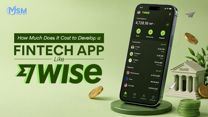
How Much Does It Cost to Develop a Fintech App Like Wise?
Sending money across countries has never been easier, and apps like Wise have completely changed how people manage international payments....
Read More